
How An AEC Website Can Be A Revenue Generating Machine
The buying process has changed and AEC firms’ website are evolving as revenue generating assets instead of marketing expenses.
Read This ArticleThe buying process has changed and AEC firms’ website are evolving as revenue generating assets instead of marketing expenses.
Read This Article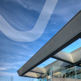
These days, employee retention is on the tips of many business owners’ tongues. According to multiple sources, such as Forbes Magazine, the young workforce is not aiming to find a company and sit comfy and stable in any decent position for the rest of their lives. Rather, fresh-faced workers want a job that actually matters […]
Read This ArticleSeparating Church and State (of Mind). At some point in our lives, each of us learns the lesson that discussing religion or politics in mixed company can backfire.
Read This ArticleOne great thing about what we do as brand and interactive designers is the variety of clients and projects we get to work on, each very different needs, goals, and audiences. One day it’s a brand and collateral aimed at investors or a website for a Japanese bistro, the next it’s a complicated website for […]
Read This ArticleWe’re proud to have designed the new brand identity and website for Jakes Construction. A contracting company that started fifteen years ago with one man named Jake, this family-owned company grew to be one of the largest construction firms in the Fraser Valley. Their previous identity no longer represented the large group of professionals or […]
Read This ArticleUPDATE: We just learned that this brand identity project has been accepted into the upcoming Communication Arts Design Annual. Woot woot! We recently worked on a fascinating branding and interactive design project for an online video sharing social network community about the non-religious aspects of Jesus. Yup, Jesus without the dogma. With a jaded Jew, […]
Read This Article